

PANZATouch & PANZAJobs MVP Release
A dual-platform experience designed to connect recruiters and IT professionals.


Project Summary
PANZATouch and PANZAJobs were created to make the hiring process in the IT world smoother and more human; one side for recruiters and recruiter admins, the other for candidates. I had the opportunity to design the MVP experience for both platforms, focusing on clear, intuitive flows that help each user find what they need quickly and confidently.
From early wireframes to polished interfaces, my goal was to build a thoughtful and approachable experience that feels supportive on both ends; whether you’re hiring top tech talent or searching for your next big opportunity.

RESEARCH
brainstorming & inspiration
At the start of the project, we kicked things off with brainstorming sessions to align on the overall vision. The goal was to revamp the internal brand and create a platform where recruiters, recruiter admins, and candidates could connect and explore IT job opportunities within their affiliated companies and internal networks. While the company already had older versions of PANZATouch.com and PANZAJobs.com, the intention was to fully redesign both websites from the ground up.
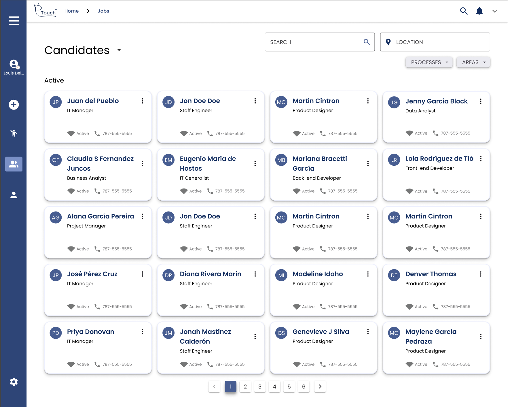
Instead of the traditional table layout, we opted for a more modern card-based design to display job listings. With that direction in mind, we began by focusing on PANZATouch and PANZATouch Admin, however this same approach ended up being the one used for PANZAJobs as well. This idea was inspired by Airbnb’s website, where they use cards creatively by allowing users to “heart” a place to stay directly from the listing — making the experience more interactive and user-friendly.

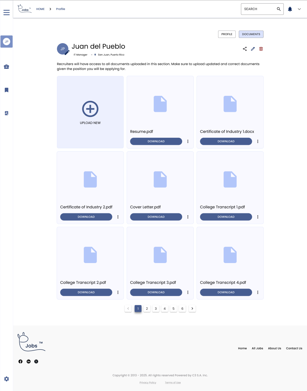
Credit to: https://www.airbnb.com/We looked for inspiration and liked how the app called Bear was layed out, with the cards on the left side and the details of the main card on the right, making the details occupy almost 65% of the real estate of the screen.

Credit to: https://bear.app/This structure for the details of a job would be fundamental for the three websites/products, since they would be displaying them the same way.
Execution

Working Within Real-World Constraints
When I joined the project, the deadline was already approaching, the BRD (Business Requirements Document) was still being developed which I was helping to create, and stakeholder involvement was limited, making it tough to gather timely feedback. Additionally, user testing wasn’t included in the scope, and there was no formal ticket sizing or structured sprint process in place.
Fortunately, I had already started wireframing ideas for the platform before officially joining the team — which became a key advantage when the project required rapid execution. This preparation allowed me to move quickly while still staying intentional with design decisions.
I collaborated closely with the Business Analyst, who had previous experience as a recruiter, to create detailed workflows for PANZATouch from both the Recruiter and Recruiter Admin perspectives. These workflows helped bring clarity to the platform’s structure, even in the absence of complete documentation.
For PANZAJobs, we iterated from the existing design foundation, introducing targeted UX improvements that focused on clarity, accessibility, and a smoother candidate journey.
Although the process didn’t follow a textbook UX approach, I adapted quickly, filled in the gaps where needed, and remained focused on delivering thoughtful, user-centered designs that aligned with the team’s goals and tight timelines.
Workflows


End result
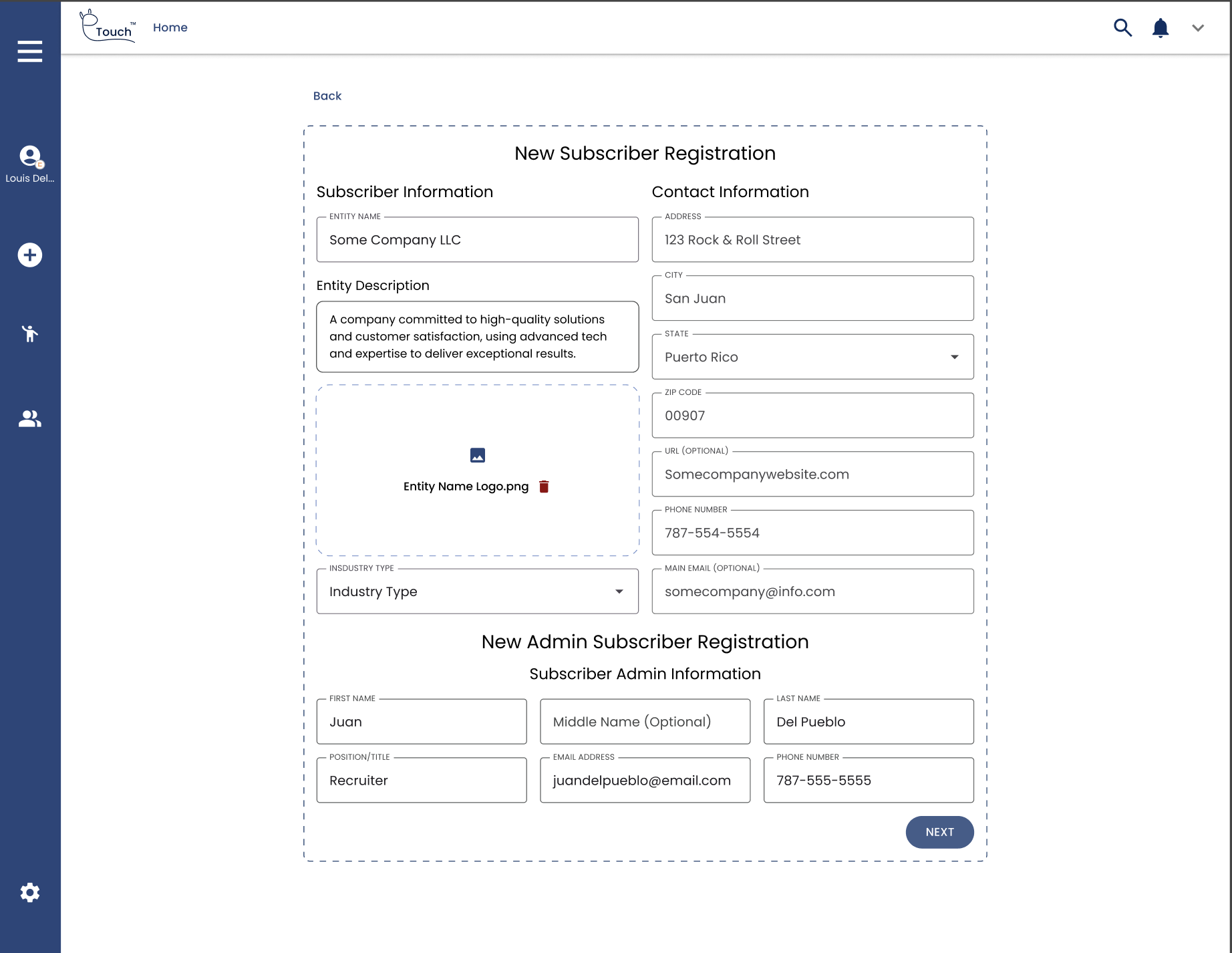
PANZATouch & PANZATouch Admin


PANZAjobs Admin


Wins/key improvements
I optimized internal processes by uncovering workflow gaps and aligning the product more closely with user needs—all while navigating tight deadlines and limited resources. This led to a 46% boost in team productivity, helping recruiters and admin users work more efficiently and effectively.